Much like iPhone, the Apple Watch has been through a steady stream of regular updates, both in terms of hardware and its watchOS platform, ever since its 2015 debut.
From adding and removing features (remember scrolling through your appointments with that weird time travel feature?), to minor additions like new workout types, watchOS just keeps getting tweak after tweak.
In 2023, though, Apple is drastically mixing things up with a more radical overhaul of watchOS. And it may just be the thing that makes me super glad to own the Apple Watch Ultra.
With that in mind, here’s how watchOS 10 is helping me combat the tinge of buyer’s remorse I have from buying Apple’s most expensive timepiece, even with rumors of an Ultra 2 appearing at Apple’s September 12 event.
Why Ultra?

This is, naturally, no one’s fault but my own. With the Series 7 headed back to Apple after reviewing it, the time had come to replace it with an Apple Watch of some description.
The trouble is that the Series 8 just felt like too small a step up for me, and the Series 7 was tougher to find used than I’d have liked. In a sensational display of why I shouldn’t be allowed to make purchasing decisions on my own, I opted for the Ultra.
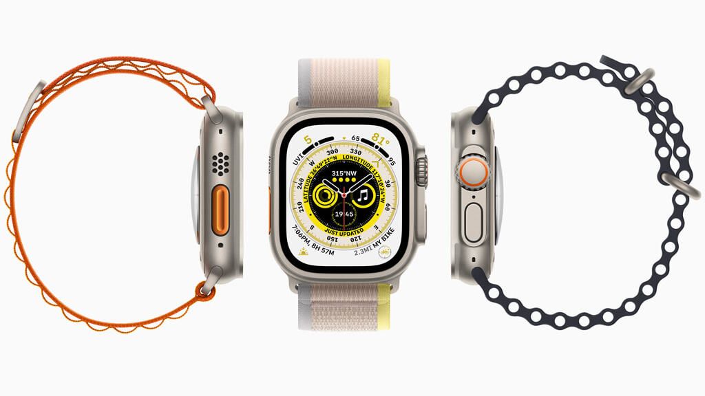
Its killer feature, for me at least, is the vastly improved battery life over the mainline watch, and while I’d love a black version, it’s a great smartwatch – the best, even.
And yet, as someone who isn’t running ultra marathons, climbing mountains, and really just using it to track workouts and use Things 3 on my wrist, it’s hard to feel I’m not getting the most out of my (not insignificant) investment.
And then came watchOS 10.
A perfect 10

It’s perhaps that nagging sense of buyer’s remorse that had me losing all resistance to the notion of installing the watchOS 10 beta.
Usually, I tend to wait for the final release because, even in 2023, there’s no real rollback process for the Apple Watch beta software. But the allure of watchOS 10’s use of the big, bright display on the Apple Watch Ultra lowered my guard (but to note, I’ve still not had any issues – other than the battery draining more quickly).
We’ve got an entire guide about what’s new in watchOS 10, but the allure here comes from how it shows off the new glanceable screens. The Apple Watch Ultra has a larger, drastically brighter display than any of its siblings in the lineup, and one only needs to hop into the overhauled Fitness app to see why that matters.
A new graph in the ‘Move’ view, for example, would’ve taken up much more of the display, but there’s now the option to adjust your fitness goals with a couple of taps, as well as the traditional “Rings” interface in the top left corner.
Third-party apps, understandably, remain in their standard views, with some, like Spotify, still feeling central but with plenty of space. If they adopt more of Apple’s design cues, things could get even better.
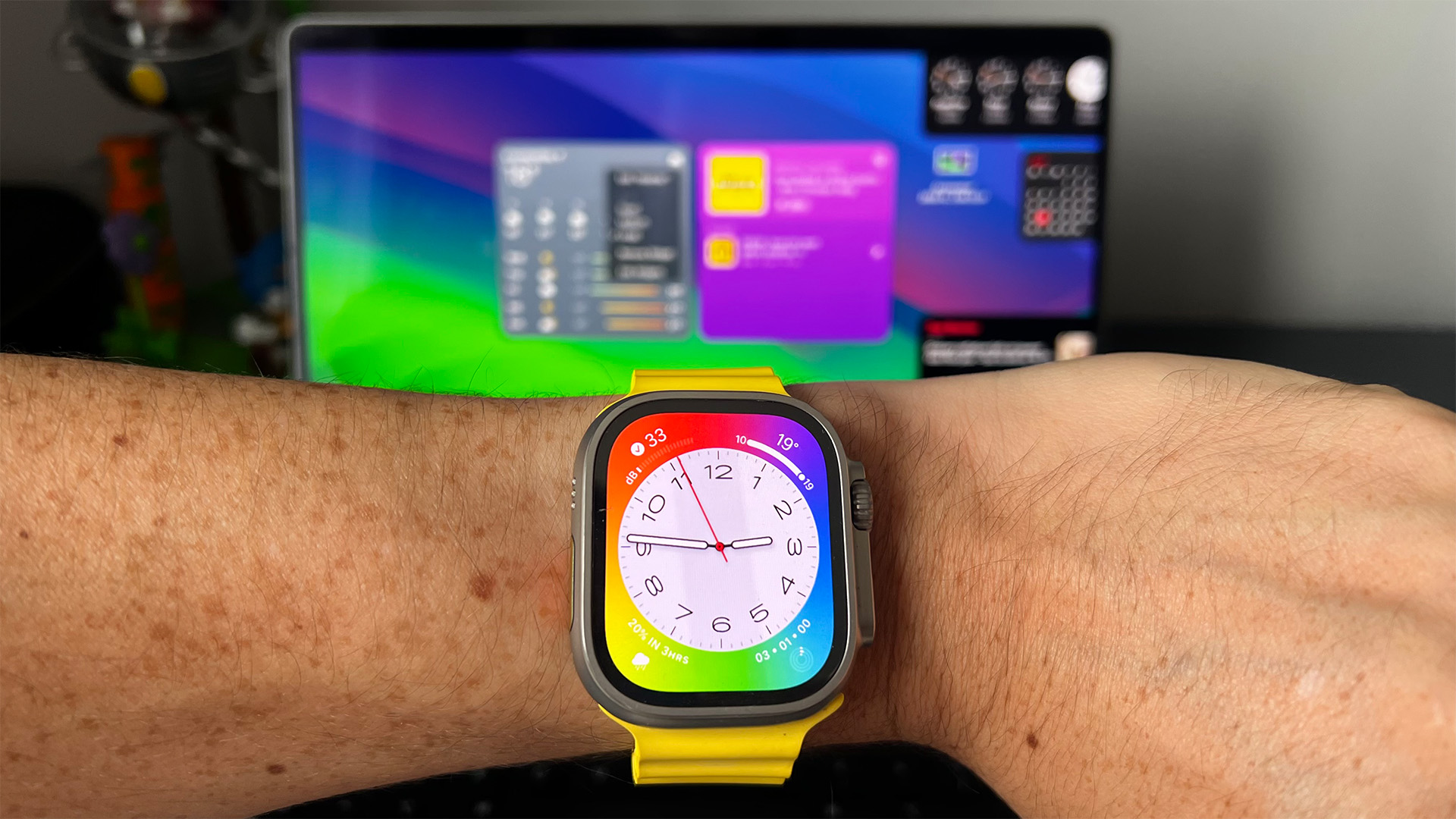
The Weather app has a new look, and ties in with the design language of the Good Morning screen to showcase the color that’s possible from the Apple Watch Ultra.
Many other apps, like Calendar or Heart Rate, just squeeze themselves closer to the bezels, and it’s a nice touch – although it does highlight those bezels. Maybe they’ll be thinner on the rumored Apple Watch Ultra 2?
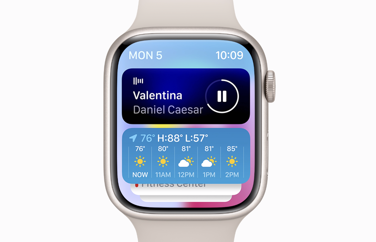
Swiping up to reveal a series of widgets is much nicer to look at when each has the run of the display to work with, too.
All of this is to say that if you’re using an Apple Watch Ultra and feel even the smallest modicum of regret about your purchase, give watchOS 10 a try. It may just surprise you, and it’s only going to get better in a few short weeks.
