macOS Sonoma is finally here, and it’s honestly hard to believe we’re a year on from Ventura. In a lot of ways, the two are pretty similar, with Sonoma following its predecessor’s lead with a whole host of nice-to-haves, rather than any sizeable must-haves.
That’s perhaps no bad thing, though – if you use a Mac regularly, the last thing you’re likely to want is to have to relearn how to work it, and many of the improvements are small but appreciated.
Whether they add up to a must-download is immaterial – provided your Mac is compatible, you’ll almost certainly be installing Sonoma anyway, but it’s still worth giving credit where it’s due. Sonoma is another small step for Mac, but if the Game Mode functionality makes it easier to port titles to the platform, it could be an important one for its future.
macOS Sonoma: Availability and compatibility
You can download macOS Sonoma right now through your Mac’s Software Update option in the System Settings menu.
You’ll need one of the following Macs to be able to install it:
- MacBook Pro: 2018 and later
- MacBook Air: 2018 and later
- Mac mini: 2018 and later
- iMac: 2019 and later
- iMac Pro: 2017
- Mac Studio: 2022 and later
- Mac Pro: 2019 and later
macOS Sonoma: Top features
Game Mode
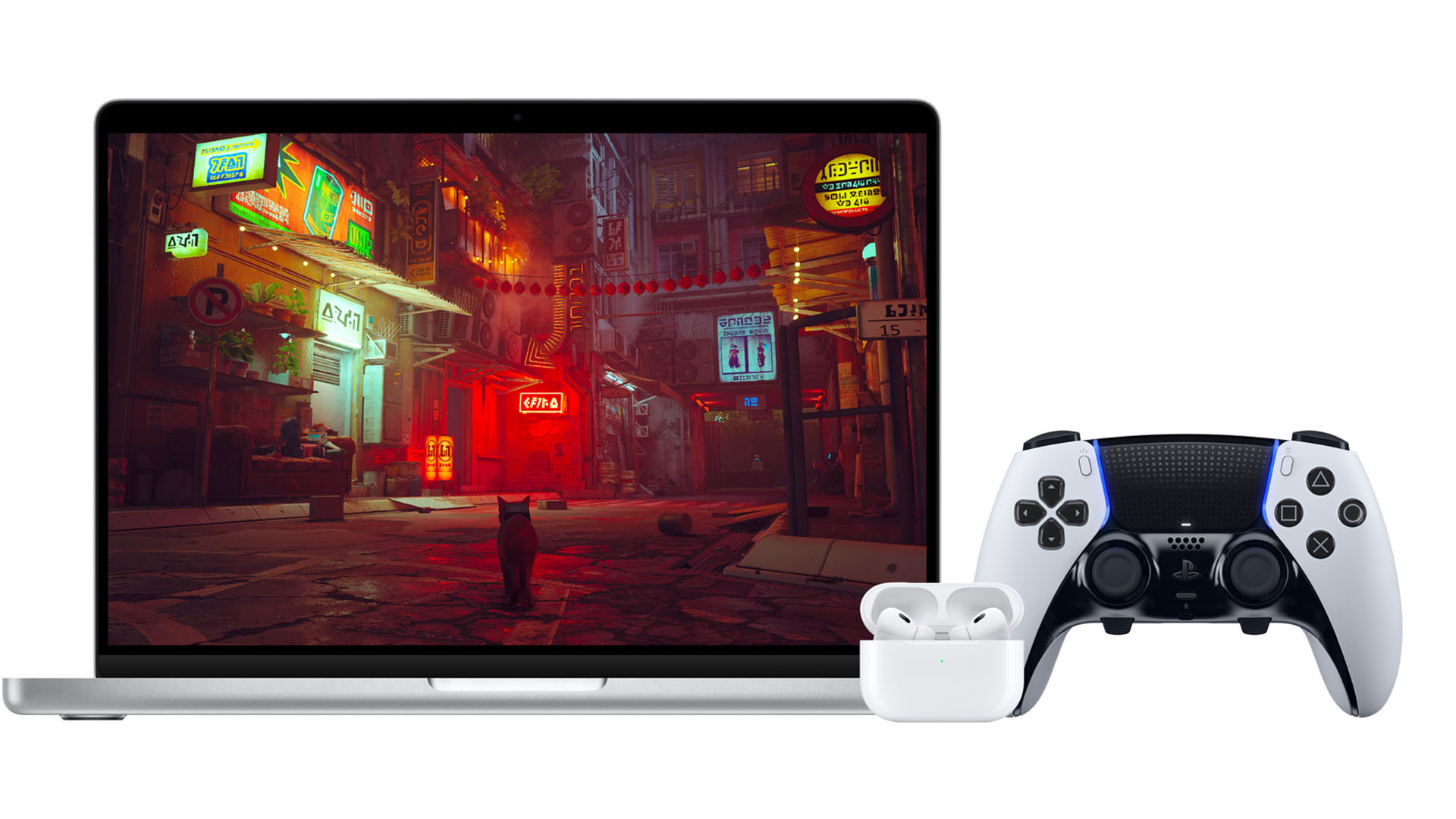
There’s arguably no better place to start than with Game Mode because this could secretly be one of macOS Sonoma’s biggest introductions.
The Mac has never been a true gaming platform in the way Windows has for PC (check out our interview with the team at Feral Interactive about the differences between the two), but the reveal of Game Mode suggests that’s something Apple is looking to change.
By dedicating more resources to a game, your Mac can prioritize resolution, frame rate, and controller or AirPod latency. That may seem like a small step, but after Apple revealed that the iPhone 15 Pro models will be able to run the likes of Resident Evil 4: Remake and Assassin’s Creed: Unity, the potential to bring big releases to the platform (perhaps even with cross-platform compatibility between iPhone, iPad and Mac), could be huge.
Safari Profiles
I’ll be honest, despite its resource-hogging reputation, I use Chrome when browsing the web on all of my Apple devices – my MacBook included.
A big part of that, and one that may have just shifted with macOS Sonoma, is the option to use specific profiles. When I’m researching birthday presents for my partner, or catching up on football (soccer, sigh) scores, I don’t want my work research and other things surfacing. On Chrome, it’s always been easier to switch between Google accounts, but Safari’s new Profiles make it easy to switch between various sections of my life.
It’s not quite the Arc browser shift, but it’s certainly a big step that closes the gap with Google’s effort.
Messages filtering
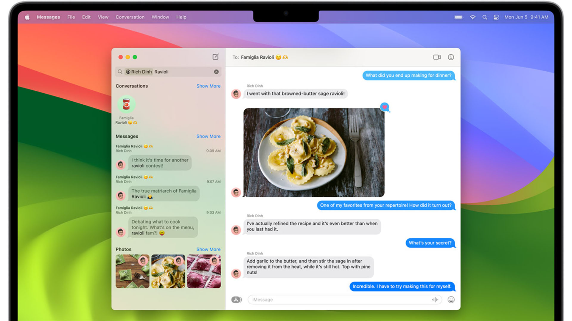
If you’re like me and often find yourself digging through old messages for something someone said, but you don’t know what it was or who it was, then Messages filtering is a small, but very welcome, improvement to the Messages experience on Mac.
Now that you can set multiple filters, you can dig through things in record time. And if you find something interesting that needs a response, you can now swipe to reply as well thanks to macOS Sonoma’s easier inline messaging.
PDFs and links in Notes
Notes has gained a few new features in recent years, and this is another huge step for the app.
While collating PDFs in Notes won’t appeal to everyone (and there are excellent research apps like Obsidian out there that do much, much more with them), if you’ve got travel itineraries, scanned documents, or even just a copy of your ID in case you need it, you can drop it into a note and have it handy at a moment’s notice.
Better yet, you can now clip various notes together with links, letting you create your own Wikis and share them with collaborators – ideal for training tools for work.
Screen Savers (yes, really)
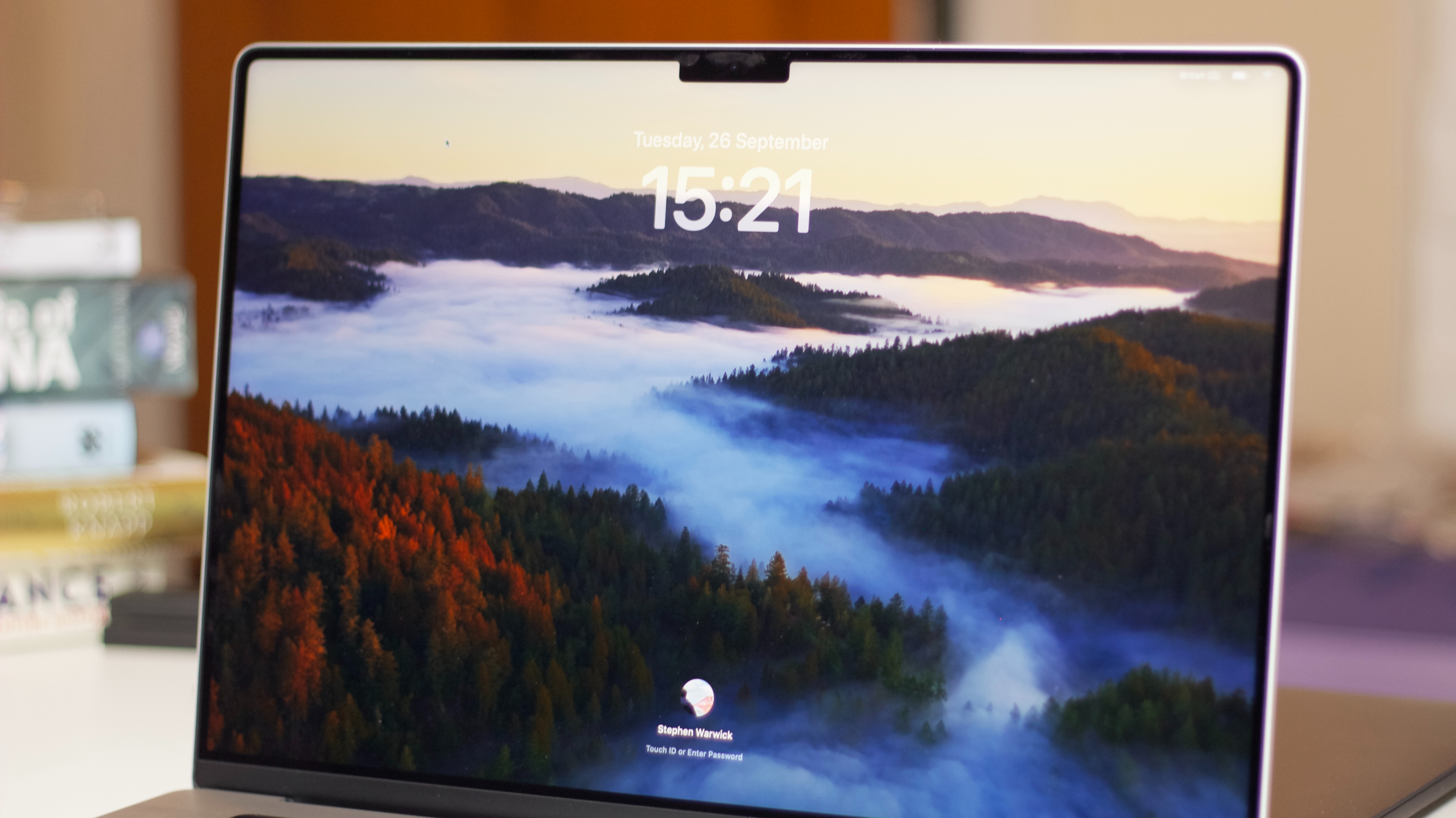
Yes, I know screen savers are nothing new, and yes, I know the Apple TV has had similar before, but the new slow-motion ones in macOS Sonoma are particularly gorgeous when viewed on a display like the MacBook Pro 16-inch.
Not only that but it’s also led to a revamped lock screen with a more visible clock. It’s a much nicer view than what we had before, and I’ve found myself turning off Apple Watch unlocks so I can enjoy it just a little bit longer (maybe I need to get out more).
AirPods Muting
Again, it’s a small thing, but being able to mute my AirPods mic when on a call with a single press of the stem is a huge help – and means I don’t accidentally resume my Spotify playlist instead.
Presenter Overlay

That brings us nicely to one of macOS Sonoma’s killer features – Presenter Overlay. If you’ve ever fancied yourself as a TV meteorologist, or a game show host, this is for you.
All joking aside, it’s likely to be crucial for important pitches that require a more personal touch than walking someone through a deck of slides, letting you add a little character.
If that pitch is successful, you can even trigger fireworks with a thumbs-up gesture, or confetti. It’s goofy, it’s totally unnecessary, but it’s that quirky side of Apple that keeps me coming back.
Desktop Widgets
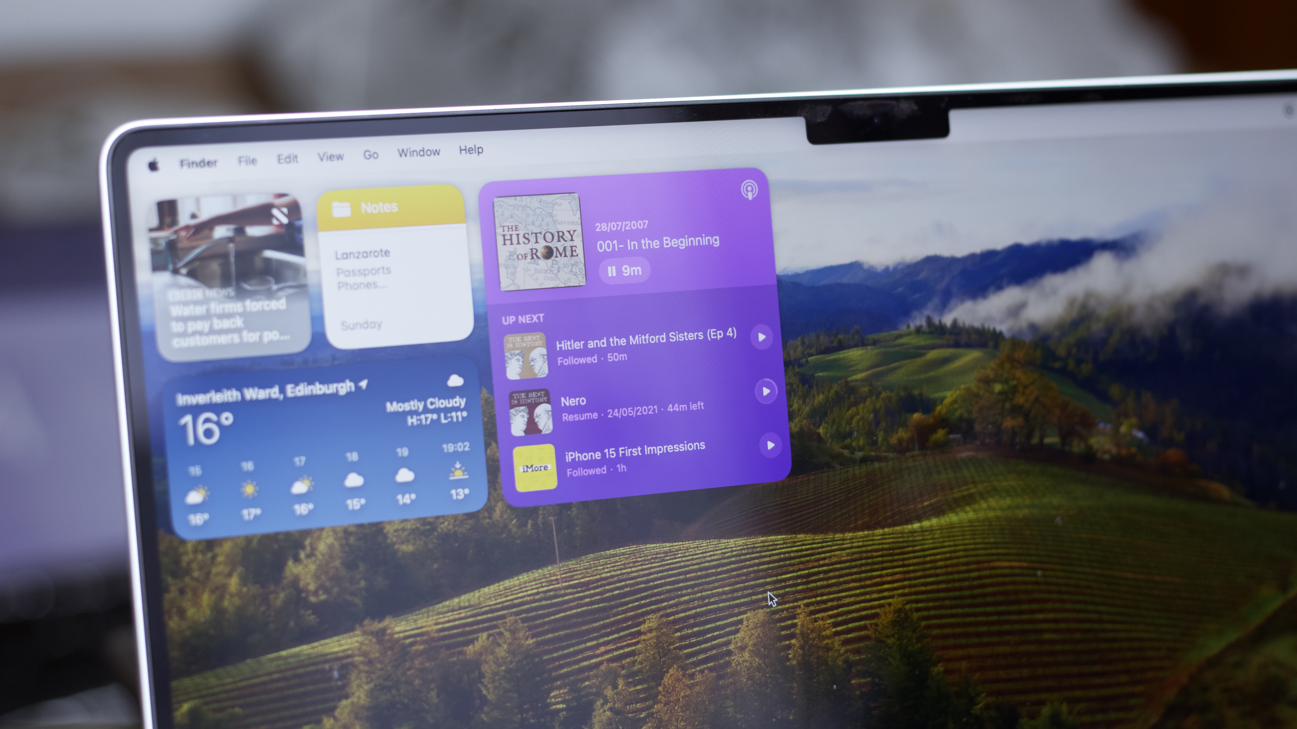
After years of pretty much ignoring they exist (rest in peace, Dashboard), Apple has gone widget crazy in the last few years.
There are widgets on iPhone, iPad, the Apple Watch, and now the Mac, too. They look great, with a universal design language based on compatibility across platforms.
That’s a double-edged sword, though, notably for Spotify users. While I was able to install the Spotify widget, it’s essentially an extension of the iPhone app – so there’s little I could do with it without having my phone open, with Spotify open, which then led to some awkward auto-AirPods switching.
Outside of those edge use cases, however, it’s a fantastic addition – and one you don’t have to engage with should you prefer a clean desktop. I still have a weather and Parcel widget on my slide-over notification panel, for example, but I’ve also got a truncated version of my Things 3 to-do list on my desktop.
It’s an extra tool for users who want to plaster widgets everywhere, but it’s no longer mandatory here as it is on the iPhone or iPad.
macOS Sonoma: Other features
Aside from the features above, there are plenty of additional updates to macOS that are coming with Sonoma.
With privacy and safety front of mind with Apple, new sensitive content warnings on videos and photos will appear in Messages and third-party apps.
Autocorrect also gets an upgrade, letting you skip ahead by using the space bar to finish words. It’s not always perfect, but it’s much closer to similar functions in Google Docs and the like.
It’s also been a long time coming, but PDFs will get AutoFill functionality “later this year”. Apple’s efforts in this space have paled compared to third-party efforts, but we’re hopeful it’ll improve the document signing experience.
I know many scoffed at the idea of adding web apps to the Dock, but I can see it being pretty useful if you use anything web-based pretty regularly – like a CMS or sign-up form.
Room for Improvement?
There’s little I can complain about with Sonoma because it’s got some great features that build on top of macOS nicely without overcomplicating anything.
And yet, it feels like it’s missing that big “headline feature” that makes it a must-download, although I’m not entirely sure what it needs right now.
While some may argue that’s the addition of desktop widgets, it’s a little too inconsistent on third-party options to guarantee it’ll be a success – although here’s hoping now that it’s out of beta we’ll see more developers adopt it (looking at you, Spotify).
macOS Sonoma: Verdict
The fact that one of my favorite features of macOS Sonoma is its lock screen wallpapers should hammer home that macOS is at the point of maturity where it doesn’t need huge new upgrades year over year.
Still, it’d be fair to say there’s not quite as much to get excited about here as there is on, say, iOS 17 or watchOS 10, but there are plenty of small quality-of-life updates that make daily Mac use even more delightful.
